Sliding through my Twitter feed a few months ago I saw the following visualisation from the Analtyics FC Gang (Tom Worville, Ben Torvaney, Sam Gregory and Bobby Gardiner) and it stuck a chord with me for the following reasons:
- Neymar is bloody good!
- Provided a easy and instinctive way of showing where players are placed in relation to their others across various KPIs.
- There are excellent opportunities to compare players side-by-side in a visually intuitive way.
- Offers a good initial way of exploring your data and attempting to pick up on patterns and narratives that could be drawn out of the data.

I have been learning R over the last few months and have been meaning to try and recreate the visualisation and ideally improve on it. Well, I finally got around to it and wanted to share the process as my first post on this blog, share some of the outputs from my version and in a second post cobble together a mini-tutorial as I certainly learnt one or two things when I was coding it up.
I have used a OPTA data set that fell off the back of a truck… a little bit battered, it was easy to dust off and utilise. The data was at a player level of aggregation with totals and averages for the EPL 2015-16 season. There are some limitations to the data but it will do for this purpose or exploring an idea.
Design
Improvements
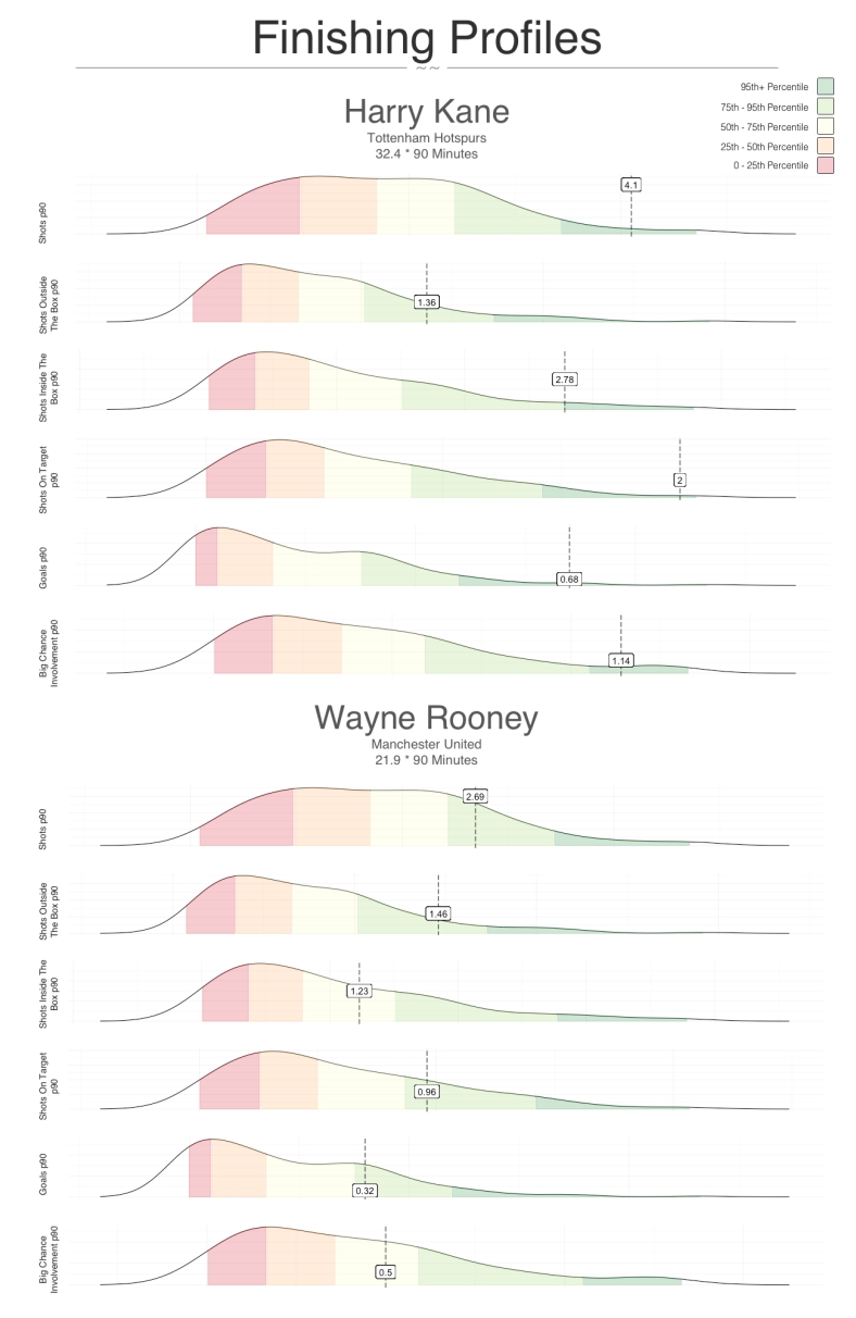
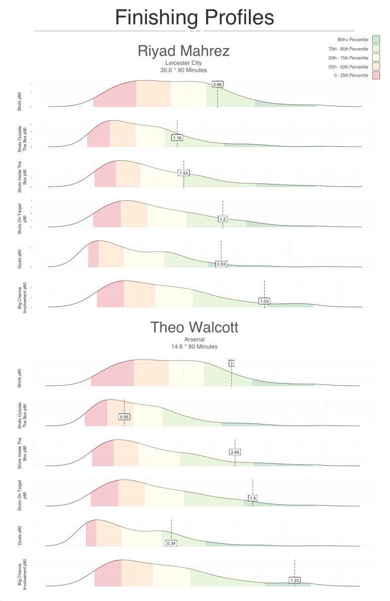
I felt I could tweak a few things to improve the graphs, namely:
- Focus the KPIs on more specific areas and create a few different types of graphs i.e. finishing or creation
- Add quartile ranges to the graphs to add even more context yet still easy to read
- Add a little bit of colour
Sample Size
- Midfielders and Forwards
- Players having played 750 minutes or more in the EPL 2015-16 Season
- Jamie Vardy has been removed due to racist tendencies
Graph 1. The Changing of the Guard
Graph 2. The New Kid on The Block and the Flop(?)
Other Profiles
There are many KPIs to use and more profiles to setup other than just finishing. I will get to these over the coming days and push them out along with the tutorial of how to create these in R. In the meantime, if you want to see the finishing profiles or any players let me know.

First time reader, first time poster. 0 involvement in football stats generation… But just a fan of good visualisations.
Like your use of distributions, gives the various metrics a context. However when comparing two (or a few) players within the same distribution, I feel you’re putting too much accent on the distribution. I wonder what a more understated (almost transparent) but larger (at least taller) distribution would look like, with the players compared shown as circles within the distribution. Then you can fit a few players even if they’re in the same area of the distribution. You can then also bring in the size of the circle, for example to show number of 90s. Perhaps Walcott does score at a similar rate to mahrez but doing it consistently over more games is interesting.
Alternatively you could chart a players development over time by drawing some funky shapes (points linked with directional arrows) within the distribution. Eg Walcotts “evolution/devolution” in his 10 years at arsenal.
LikeLike
Some excellent ideas there Boris! Something that will play with and post if it looks as good as it sounds it would.
Thanks very much for your comment, engagement and ideas
LikeLike