STRASLE Graph : Striker’s Adrenaline-Stimulated Luck Evaluator

On the wet streets of Manchester there is a subdued mood, United seem rudderless whilst City have been limping over the line and taken recent solace in celebrating the anniversary of Sergio Agüero’s goal against QPR. Grabbing at straws through the mist both sets of fans have clenched onto two young strikers who’s goalscoring record-sheets have been helping to absorb the fans’ tears.

Marcus Rashford and Kelechi Iheanacho have been hitting the back on the net at such an impressive rate, its created a whirlwind of excitement fuelling projections of the pair being world-class strikers of the future.

“He’s a very good young player. I see some of myself in him for sure – he has courage and he’s fast and is very good with the ball. I think for the strikers they have to be hungry to score and I see that with him. He has an amazing future”

Ronaldo (BRA) on Rashford

No doubt, an exciting narrative but how excited should the fans be? Are their performances repeatable?  Expected Goals legend Michael Caley recently stirred the debate with a xG + xA / 90 graph that inspired this post.

The objective analysis of goal scorers has evolved and improved in recent years, with per90 metrics and expected goal models. Yet there also emerged some consensus that the output of goal scorers is best observed over a longer period of time, circa 18 months and 4,500+ minutes. When it comes to young strikers we don’t currently have the required sample size to reach more reliable projections of future goal scoring output. In the absence of reliable modelling there needs to be some data-stimulated debate within recruitment departments of clubs looking to invest in a young high-scoring striker.

Introducing… The STRASLE Graph (Striker’s Adrenaline-Stimulated Luck Evaluator)

The purpose of STRASLE is to help stimulate debate : Is a strikers goal scoring output sustainable and repeatable? The Actual-Expected xG -/+ and Conversion Rate is plotted for each young striker is plotted for all midfielders and forwards that have scored but played less that 1,200 minutes. The filtering does not remove older players, however STRASLE could be used to help assess goal scorers with a low number of minutes due to injury or deselection.
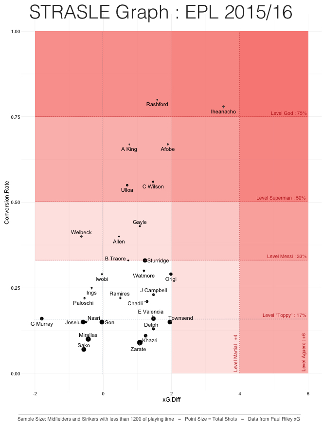
Strasle3

The Eye-Test

  1. If a club were weighing up transfers for Rashford or Iheanacho, they should proceed with caution due to both players having an unrepeatable conversion rate as well as a high Actual-Expected Goals difference.
  2. Daniel Sturridge shows excellent levels of performance despite his low minutes this season. Numbers which based on previous high performance in previous seasons would give a recruitment team confidence in their repeatability. This is especially due to the number of shots taken gives the conversion rate greater validity.
  3. Bertrand Traore, Iwobi and Origi locations would facilitate an interesting discussion.

Conclusion

Rashford and Iheanacho’s scoring output is certainly not sustainable! However, they both sit in realms of extreme conversion rates and positive xG difference. With more minutes there conversion rate will fall, their xG difference may move closer to average. The whirlwind of excitement will drop but left behind could be some amazing players.

It is therefore the job of the clubs and coaching staff to manage expectations and to keep the players working on continued improvements rather than getting swept up in the noise.

City seem to be doing this with Iheanacho…

“It was very important for Kelechi to demonstrate once again that he’s a very good player. He’s not just a striker – he provided two assists. I’m very happy for him. He has things to improve but he’s working in the correct way”

Manuel Pellegrini on Iheanacho

Notes:

  1. Thanks to Paul Riley for his amazing Premier League 2015/16 xG Map and Table as well as the data behind it.

KPI Density Plots V.2

After posting my KPI Density Plots (post containing explanation) yesterday, they got some positive response on twitter and importantly I got some good constructive feedback from Marek Kwiatkowski and Thom Lawrence. I quickly implemented their idea and it no doubt improved things – although Marek has tempted me into the difficult task for finding a different font… leaving that one for a rainy day… (font suggestions welcome!)

Within the comments section of the blog post I received this great idea from Boris Zlatopolsky, this is an idea I feel has some legs and will bash it out soon:

Like your use of distributions, gives the various metrics a context. However when comparing two (or a few) players within the same distribution, I feel you’re putting too much accent on the distribution. I wonder what a more understated (almost transparent) but larger (at least taller) distribution would look like, with the players compared shown as circles within the distribution. Then you can fit a few players even if they’re in the same area of the distribution. You can then also bring in the size of the circle, for example to show number of 90s. Perhaps Walcott does score at a similar rate to Mahrez but doing it consistently over more games is interesting.

In addition to these changes I also wanted to add more KPIs and section them into logical groupings: 1) Finishing 2) Creating 3) Defence. I feel these give a good overview of offensive players in a quick way and comparative to their competitors.

I therefore introduce KPI Density Plots V.2, with the assistance of three excellent attacking midfielders – Ozil, Payet and Coutinho;

MOzil FullDPayet FullPCout Full

KPI Density Charts – An R Experiment

Sliding through my Twitter feed a few months ago I saw the following visualisation from the Analtyics FC Gang (Tom Worville, Ben Torvaney, Sam Gregory and Bobby Gardiner) and it stuck a chord with me for the following reasons:

  1. Neymar is bloody good!
  2. Provided a easy and instinctive way of showing where players are placed in relation to their others across various KPIs.
  3. There are excellent opportunities to compare players side-by-side in a visually intuitive way.
  4. Offers a good initial way of exploring your data and attempting to pick up on patterns and narratives that could be drawn out of the data.

CWtWmqQWUAAfwFS


I have been learning R over the last few months and have been meaning to try and recreate the visualisation and ideally improve on it.  Well, I finally got around to it and wanted to share the process as my first post on this blog, share some of the outputs from my version and in a second post cobble together a mini-tutorial as I certainly learnt one or two things when I was coding it up.

I have used a OPTA data set that fell off the back of a truck… a little bit battered, it was easy to dust off and utilise. The data was at a player level of aggregation with totals and averages for the EPL 2015-16 season. There are some limitations to the data but it will do for this purpose or exploring an idea.

Design

Improvements

I felt I could tweak a few things to improve the graphs, namely:

  1. Focus the KPIs on more specific areas and create a few different types of graphs i.e. finishing or creation
  2. Add quartile ranges to the graphs to add even more context yet still easy to read
  3. Add a little bit of colour

Sample Size

  1. Midfielders and Forwards
  2. Players having played 750 minutes or more in the EPL 2015-16 Season
  3. Jamie Vardy has been removed due to racist tendencies

Graph 1. The Changing of the Guard 

Rooney v Kane.jpg

Graph 2. The New Kid on The Block and the Flop(?)

Walcott v Mahrez 

Other Profiles

There are many KPIs to use and more profiles to setup other than just finishing. I will get to these over the coming days and push them out along with the tutorial of how to create these in R. In the meantime, if you want to see the finishing profiles or any players let me know.